
Views: 0 Author: Site Editor Publish Time: 2026-08-13 Origin: Site


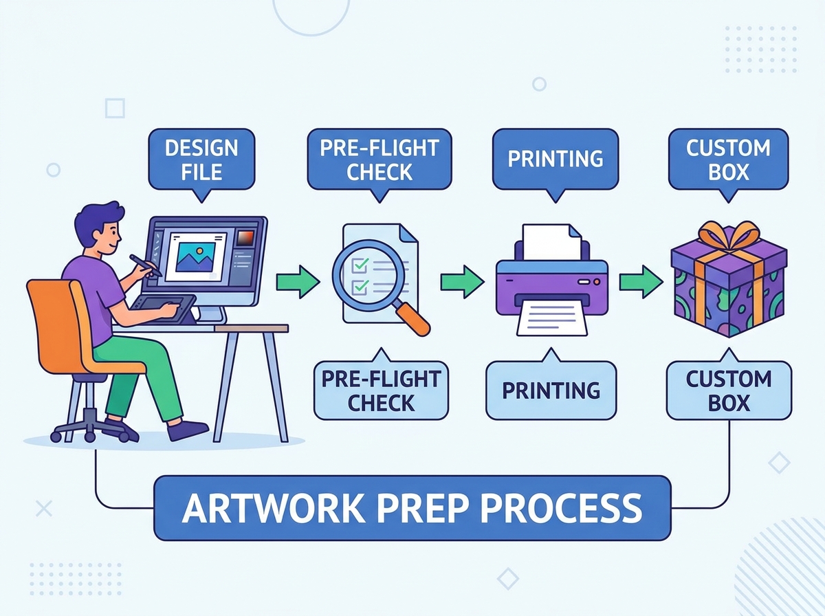
Translating a digital design into a physical printed package reveals a massive gap between screen and reality. What looks perfectly aligned on a monitor can easily become muddy, misregistered, or cut off on the press. Improper artwork preparation leads to production delays, color shifting, and a compromised unboxing experience that damages brand perception. You need a precise, technical approach to file preparation. Packaging design requires strict adherence to dielines, color models, and substrate limitations. This guide provides a step-by-step framework for preparing print-ready files. We will cover how to ensure your final manufactured custom gift box matches your original design intent without expensive reprints. By following these mechanical requirements, you eliminate prepress rejections and streamline the entire manufacturing workflow.
Define the Brief and Box Style First: Before designing, determine the box style (e.g., rigid, mailer, folding carton) and precise product dimensions to obtain a custom dieline.
Color Accuracy Requires CMYK: All digital artwork must be converted from RGB to CMYK or specific Pantone (PMS) spot colors prior to submission to prevent unpredictable color shifts during printing.
Dieline Compliance is Non-Negotiable: Artwork must strictly adhere to the manufacturer's dieline, respecting bleed areas (usually 0.125" to 0.25"), trim lines, and safe text zones to account for mechanical shifting during the die-cutting process.
Vector Over Raster: Logos, typography, and brand marks should be submitted as vector graphics (AI, EPS, or vector PDF) to ensure infinite scalability and crisp edges. Any rasterized photographic elements must be a minimum of 300 DPI at actual print size.
Material Dictates Print Behavior: The substrate of the packaging (e.g., uncoated kraft paper vs. coated white board) fundamentally alters ink absorption and color appearance, requiring specific design adjustments before final export.
Before opening any design software, you must define the physical parameters of your packaging. The design brief outlines the functional requirements. Consider whether the box is for retail display, rugged e-commerce shipping, or protecting fragile items. Each application demands a specific structural approach and material choice.
The structural style dictates the dieline you will use. Rigid boxes, featuring a separate lid and base, are the standard for high-end luxury presentation. Mailer boxes are highly durable, making them ideal for shipping and subscription services. Folding cartons offer a lightweight, cost-effective solution suited for smaller retail items.
Box Style | Primary Application | Material Thickness | Print Capability |
|---|---|---|---|
Rigid (Lid & Base) | Luxury retail, electronics | 800gsm - 1200gsm chipboard | High (litho-laminate wraps) |
Corrugated Mailer | E-commerce, subscriptions | E-flute or B-flute | Medium to High (flexo or litho) |
Folding Carton | Cosmetics, lightweight goods | 250gsm - 400gsm paperboard | Very High (direct offset) |
Precise measurements are critical. Measure the maximum length, width, and depth of the product. You must also account for internal components like custom foam inserts, molded pulp trays, or protective tissue paper. Provide these exact internal dimensions to your manufacturer to ensure a secure fit. A loose fit causes product damage during transit, while a tight fit tears the internal inserts.
Measure the primary product at its widest points using digital calipers.
Add tolerance for internal inserts, typically 2mm to 5mm depending on the material.
Determine the orientation of the product inside the cavity.
Calculate the final internal dimensions (Length x Width x Depth).
Request a structural sample based on these dimensions before applying artwork.
A custom box is a three-dimensional object printed on a two-dimensional flat sheet. The dieline acts as the architectural blueprint. It tells the machinery exactly where to cut, crease, and fold the material. Ignoring dieline rules guarantees a rejected file or a ruined production run.
The bleed area extends your background colors and patterns past the cut line. This mitigates slight registration variances on the printing press, preventing unwanted white edges. Trim lines indicate the exact perimeter where the physical cutting blade strikes the substrate. Die-cutting machines have a mechanical tolerance of about 1mm to 2mm. If your artwork stops exactly at the trim line, any machine shift will expose the unprinted paperboard.
Crease lines show where the material will be scored and folded. Never place critical design elements or small text directly over folds. The folding process stretches the paper fibers, causing ink cracking and structural tearing. Safe zones establish an internal margin, typically 1/8 inch inside the trim line. All logos and text must reside within this zone to guarantee they are not clipped during die-cutting.
Monitors display colors using RGB (red, green, blue) light, while printing presses use CMYK (cyan, magenta, yellow, black) ink. You must convert files to CMYK early in the design process to accurately preview the printable color gamut. Designing in RGB and converting at the last minute results in dull, muddy colors.
For absolute brand color consistency across different print runs, specify Pantone spot colors. While PMS colors often require higher minimum order quantities and incur extra costs, they provide exact color matching that CMYK sometimes cannot achieve. Spot colors are mixed physically before hitting the press, ensuring the exact hue every time.
The material you choose fundamentally alters ink appearance. Coated white board yields vibrant, accurate colors and is best for photographic designs. Uncoated kraft board absorbs ink heavily, darkening colors significantly. If you print on kraft, use darker, high-contrast inks or apply a white ink base layer under your colors. The natural brown fibers of kraft paper will show through transparent CMYK inks, shifting the color spectrum toward warm, muddy tones.
For large background areas, use a "Rich Black" CMYK breakdown (e.g., C:60, M:40, Y:40, K:100) to avoid a washed-out, dark gray appearance. However, for fine text or barcodes, use 100% K (standard black) to prevent registration blurring on the press. If you use Rich Black for small text, the four color plates may not align perfectly, causing a blurry, unreadable shadow effect.
Print requires much higher resolution than digital screens. All rasterized images, such as JPEGs or TIFFs, must be embedded at 300 Dots Per Inch (DPI) at 100% of their physical print size. Upscaling low-resolution web images results in severe pixelation. A 72 DPI image pulled from a website will look like a blurry mosaic when printed on a physical package.
Submit all logos and iconography as vector formats to maintain sharp edges. Before exporting your final file, convert all live text to outlines or shapes. This prevents missing font errors and unwanted font substitutions on the manufacturer's prepress computers. Keep minimum font sizes around 6pt for solid colors and 8pt for reversed-out text to ensure legibility.
Select all text in Adobe Illustrator.
Navigate to Type > Create Outlines.
Verify that no live text remains in the document properties.
Save a separate working copy of the file before outlining, in case you need to edit the copy later.
Specialty finishes require specific file preparation. You must isolate these elements onto their own distinct layers within your design software. Mixing foil or UV elements on the same layer as your CMYK artwork causes prepress confusion and delays.
Create vector masks for Spot UV and foil stamping. Designate these areas using a 100% solid spot color, such as 100% Magenta, and rename the swatch to "Spot UV" or "Gold Foil." Set these elements to "Overprint" so they do not knock out the artwork beneath them. For embossing and debossing, maintain adequate line thickness and spacing to prevent the paperboard from tearing during the stamping process. Fine lines under 1pt will not emboss cleanly.
Use industry-standard vector and layout programs like Adobe Illustrator or InDesign. Avoid raster-based software or non-print platforms for final mechanicals. Photoshop is excellent for editing photos, but it is terrible for typesetting and dieline management.
Separate the dieline, artwork, and specialty finishes into locked, clearly named layers. Export the file as a High-Quality Print PDF or PDF/X-1a:2001. Ensure the dieline is set to "Overprint" so it does not knock out the artwork beneath it. Use lossless compression to group linked high-resolution assets.
Layer Name | Content | Attribute Setting |
|---|---|---|
Dieline | Cut and crease lines | Overprint Stroke |
Foil Stamping | Vector shapes for foil | Overprint Fill (Spot Color) |
Artwork | CMYK graphics and text | Standard Knockout |
Manufacturers frequently reject files due to missing bleeds, unlinked images, or unflattened transparencies. Another common issue is Total Ink Coverage (TIC) exceeding 300%, which causes smudging, slow drying times, and paper warping. Always audit your files against these points before submission. Check your document color mode, verify link status in the links panel, and use the separation preview tool to check ink limits.
Meticulous artwork preparation separates premium, retail-ready packaging from amateur, flawed prints. By strictly following dieline rules, managing color profiles, and organizing your layers, you ensure a smooth production process. Proper file setup eliminates the back-and-forth with prepress departments and guarantees your packaging looks exactly as intended.
Audit your final PDF using Acrobat Pro's Preflight tool to catch RGB elements and low-resolution images.
Request a digital 3D proof to verify orientation and alignment before authorizing full production.
Order a physical, unprinted structural sample to confirm product fit and structural integrity.
Obtain a single-unit digital print sample to verify color accuracy on your chosen substrate.
A: The best formats are vector-based PDFs, Adobe Illustrator (AI), or EPS files. Ensure all fonts are outlined, images are embedded at 300 DPI, and the file is set to the CMYK color space.
A: Screens use RGB light to display colors, while printers use CMYK ink. The CMYK gamut is smaller, meaning some bright screen colors cannot be printed. Additionally, the substrate material absorbs ink differently, affecting the final color appearance.
A: Yes, but with limitations. Kraft paper is porous and brown, which absorbs ink and darkens the image, altering colors and reducing contrast. For photographic printing, coated white board is recommended, or you must use a white ink underprint on the kraft material.
A: Standard packaging bleed is typically 0.125 inches (1/8 inch) to 0.25 inches beyond the trim line. Always check with your specific manufacturer, as requirements can vary based on the thickness of the material and the printing equipment used.
A: Outlining fonts converts live, editable text into vector shapes. This ensures that when the printer opens your file, the text looks exactly as you designed it, even if they do not have that specific font installed on their computers.
A: TIC is the combined percentage of Cyan, Magenta, Yellow, and Black ink in a specific area. If it exceeds 300%, the paper becomes oversaturated. This leads to long drying times, ink smudging, and potential warping of the paperboard.


